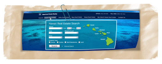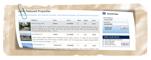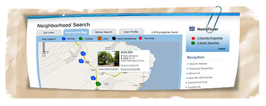
I was recently hired to re-design Hawaii Real Estate’s most popular website, Adrhi.com. While the old website did it’s job in the past, it was extremely out-dated in both design and usability. Under the hood, the html was a table based layout with inline styles that needed to go.
So, Brian Joseph Studios got to work on a new design for the site, working closely with the client. The re-design not only had to be clean and organized, but the usability of the site was the number one factor. This website has a lot of powerful tools for someone looking for real estate, and creating a friendly user-interface for these tools was vital to the success of the project.

We began with the real estate search engine. This is the number one reason why the visitor to the site is there, and so we made the search engine a prominent feature on the homepage. In addition to the search engine, the homepage is heavily optimized. The website has ranked #1 on Google for "Hawaii Real Estate" for a few years, and this new website is going to not only continue that ranking, but also target additional search terms to increase traffic.
The CSS based layout allows for extremely clean code and highly visible content. The internal linking system ensures that all pages will receive some strong juice from the more prominent pages on the site. Users can sign up and receive email updates, edit profiles, save searches, save favorites and much more. There will also be an interactive Google map search function on the site soon when that piece of functionality has been completed.

So, check out adrhi.com when you get a chance. We put a lot of effort in the overall layout of the site, use of white space, organization etc to really keep the user experience a relaxed one. There is still a lot of programming to be completed on the site, bugs to remove etc, as we had to launch sooner than expected, but once it is all complete, you will see some additional features that are currently not available.
I would be interested to hear from fellow web designers/developers and their thoughts on the new site! Please comment below, thanks!
