 If you have ever underestimated the power of social media in our society, now is the time to take a fresh look at its power.
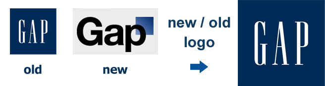
Just seven days ago, Gap launched a new logo on their website, Gap.com, and instantly received a backlash from the online community on social media websites like Twitter and Facebook. Professional logo designers came out in force, discussing the new Gap logo with the vast majority in agreement that the new identity fails on many levels.
Here on the Brian Joseph Studios’ blog, we were one of the first to realize the logo change on Gap.com and posted about the new Gap logo here.
Just a few hours ago on this Monday evening, Gap published a statement on their website announcing their decision to revert back to their iconic logo. Even more impressive, and to the delight of professional designers around the world, they also used this statement to somewhat apologize for their mistake in attempting to use crowdsourcing for the further development of their brand. Crowdsourcing design is an unprofessional way to go about acquiring design work as it results in amateur (and some professional) designers working for free in the hope that their creations will be the chosen one, and ultimately only one designer gets paid.
Gap quickly realized that their decision to entertain the crowdsourcing idea was a harmful one to the Gap brand, and they recognized this in their statement this evening.
“Since we rolled out an updated version of our logo last week on our website, we’ve seen an outpouring of comments from customers and the online community in support of the iconic blue box logo.
Last week, we moved to address the feedback and began exploring how we could tap into all of the passion. Ultimately, we’ve learned just how much energy there is around our brand. All roads were leading us back to the blue box, so we’ve made the decision not to use the new logo on gap.com any further.
At Gap brand, our customers have always come first. We’ve been listening to and watching all of the comments this past week. We heard them say over and over again they are passionate about our blue box logo, and they want it back. So we’ve made the decision to do just that – we will bring it back across all channels.
In the meantime, the website will go back to our iconic blue box logo and, for Holiday, we’ll turn our blue box red for our seasonal campaign.
We’ve learned a lot in this process. And we are clear that we did not go about this in the right way. We recognize that we missed the opportunity to engage with the online community. This wasn’t the right project at the right time for crowd sourcing.
There may be a time to evolve our logo, but if and when that time comes, we’ll handle it in a different way.”
Congratulations to Gap and their team for listening to the masses online, and for making a decision that will ultimately allow the Gap brand to grow and evolve into an even more successful identity.