
We just launched a new identity, brand and website for Alliant Association Management, an HOA and condominium management company that has served Southwest Florida communities since 2005. The project covered everything from the first logo sketches to a full brand guidelines manual and a brand new site at alliantam.com.
Client
Alliant Association Management
Serving
Southwest Florida since 2005
What we did
Logo, brand identity and website
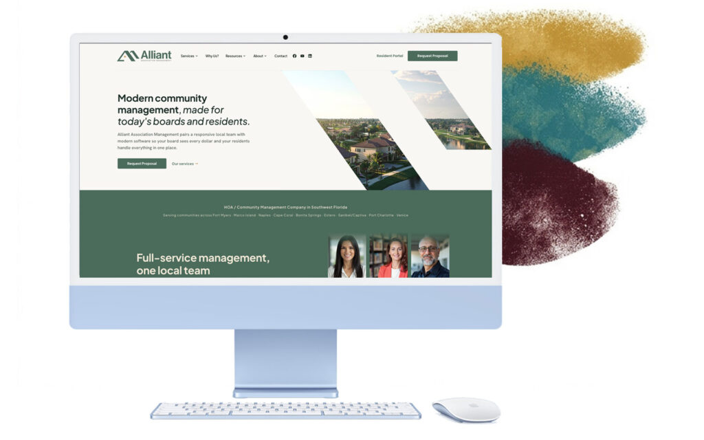
The new alliantam.com homepage.
A logo built from two A’s and a roofline
The new mark uses two interlocking angular strokes to form a dual-pitch roofline. Read one way, it is the letter A. Read another, it is the gable of a house. Together the two A’s form an M, so the mark quietly spells out AAM: Alliant Association Management. Shelter, protection and community, all under one roof.
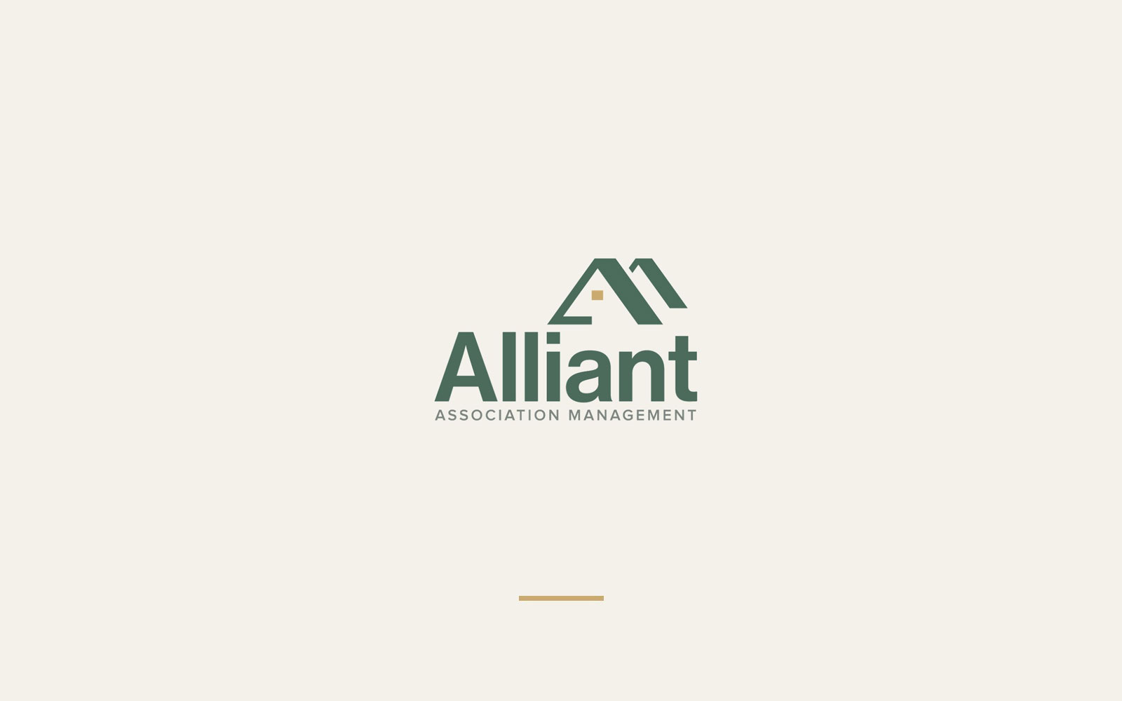
Two A’s, one roof
The second, offset stroke behind the primary A reinforces the name Alliant and suggests several homes inside one community.
Depth at any size
The shadow arm recedes into the negative space, which gives the mark real depth and keeps it crisp from a favicon to a monument sign.
A light on in the home
A single Sanibel Gold square sits at the apex of the inner A. It reads as a lit window, a door light and a small note of welcome. It is the emotional heart of the whole concept.
A complete logo system
A logo has to work in a lot of places, so we built a full system around it. There is a stacked primary logo, a horizontal version for website headers and email signatures, and five icon treatments for social profiles, favicons and anywhere space is tight.

Standalone mark
Round, solid
Round, outline
Square, solid
Square, outline
Color and typography
The palette is intentionally restrained. A calm Mangrove green carries the brand, Warm White keeps every surface clean, Charcoal handles body text and a small amount of Sanibel Gold draws the eye to the details that matter. Every text and background pairing was checked against WCAG 2.1 AA contrast standards, and the brand typeface, Plus Jakarta Sans, is free to license and easy for any vendor to use.
Mangrove
#4B6B5B
Primary brand color
Sanibel Gold
#CBAA6F
Accent and the roof window
Charcoal
#2A2A2A
Body text
Warm White
#F9F7F4
Primary background
Everything is documented in a brand guidelines manual, from clear space and minimum sizes to color values for print and web, so the identity stays consistent on every sign, letter and screen.
A website that works as hard as their team does
The goal online was simple: make it easy for every kind of visitor to get what they came for. Boards can explore services and request a proposal in a few clicks, residents get a direct path to the portal and online payments, and all five local offices, from Fort Myers to Venice, are easy to find.
Services are organized around what boards actually need.
What we built
- Modern, mobile-first design
- Clear service pages for management, technology and lifestyle
- Local SEO for Fort Myers, Naples, Cape Coral, Marco Island and more
- A streamlined Request Proposal flow
- A direct path to the resident portal and online payments
Five offices, all in Southwest Florida.
Congratulations, Alliant Association Management
Congratulations to the Alliant team on a successful brand and website launch. It was a pleasure helping a local company with deep roots in Southwest Florida present itself with the same care it brings to every community it manages. Take a look at the new site, and if your organization is ready for a fresh brand or website, we would love to hear about it.