“Originally posted on BrianYerkes.com“
Last week we discussed “Format” as Part 1 of this 7 part series on Logo Design Composition.
 | Part 2: Symmetry |
Humans perceive symmetry as harmonical. Visual things that are symmetrical provide a calming effect, and we recognize them more easily. Symmetry signalizes a form of stability. This is why we often use symmetry unconsciously in logo design.
Symmetry can be utilized in many kinds of ways:
Fourfold – that is, three times at angles of 90° – to create a symmetrical logo. You can also just mirror an element horizontally or vertically, so the elements occur twice.
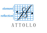
Sometimes, symmetry is used to create an effect of reflection, e.g. the reflection on water or a shiny floor.

Next Week, Part 3 : Proportions
