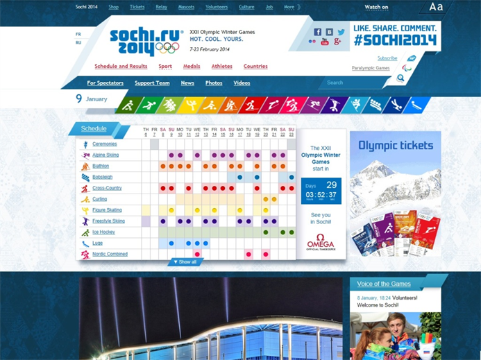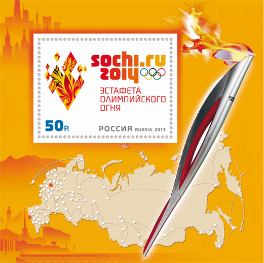
As with all major events around the world, we here at Brian Joseph Studios get just as excited about the branding and website design of the event as we do about the actual competition. The 2014 Winter Olympics in Sochi, Russia have been widely publicized on social media for some rather questionable accommodations, but let’s take a look at the overall branding of the games.
The Sochi 2014 Olympic Games do not have a logo icon, only a word mark. This is the first time the Olympic games haven’t had a logo icon since Mexico 1968. Another unique aspect of the Sochi 2014 logo is that it is the first Olympic games to use their website’s domain name extension in official logo.
“The Sochi 2014 brand fits perfectly with our commitment to use the digital revolution to help young people experience sport for the first time; with a view to active participation and long-term engagement with sport and Olympism.” – Sochi 2014 website
Images courtesy of: http://www.interbrand.com/en/our-work/Sochi-2014.aspx & http://www.sochi2014.com/


