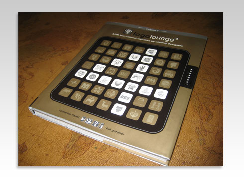
I received my copy of Logo Lounge 4 in the mail yesterday. If you don’t know what the Logo Lounge books are about here is a small summary from LogoLounge.com
The LogoLounge books have quickly become the best-selling series of design books in the Rockport line. That’s thanks to designers like you, who have become members of the LogoLounge.com site, simultaneously offering their work for consideration in future books.

The book presents the year’s best of the best corporate identities uploaded to the LogoLounge.com website by it’s huge member list. There is currently over 50,000 logos in their searchable database!
A small sampling of that, 2,000 to be exact, are included in LogoLounge 4, and as always, it will be a great book to escape in for some logo design inspiration.
One of my favorite things about these books is that it gives me a visual summary of the year’s logo design trends. There are many styles but most can be attached to a certain trend.

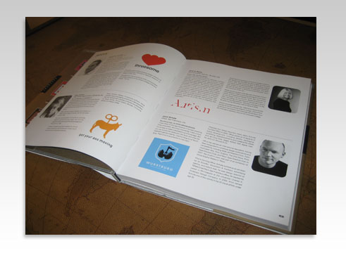
I particularly enjoyed learning about the "Autism" logo designed by Dino Design.
"I really liked the idea of using a classic, beautiful typeface like Caslon that is highly legible, and then deconstructing it with a few deft deletions. The missing strokes create an impression of strength and potential but with gaps. It is a word that is there, but not there. I think it is a perfect metaphor to represent this condition which affects communication skills and cognitive functions in increasing numbers of children."


 Here are a few from LogoLounge.com where they discuss these trends for 2007.
Dos Helix

1.Design Firm: lwdgraphics Client: Chillosophy 2.Design Firm: Sumo Client: Science City 3.Design Firm: Demasi Jones Client: RCRH 4.Design Firm: Gibson Client: Women for Women
(read more about this trend here ) Rubber Bands

1.Design Firm: Koch Creative Group Client: MBM Study 5 2.Design Firm: Substrate Client: Zilo 3.Design Firm: Grafikonline Client: Guba 4.Design Firm: Enterprise IG Client: Invista
(read more about this trend here )
Radiance
 1.Design Firm: Cato Purnell Partners Client: Skywest Airlines 2.Design Firm: Gardner Design Client: The Center 3.Design Firm: LandDesign Client: Sunhaven 4.Design Firm: Siegel+Gale Client: SunTrust (read more about this trend here )
Eco Smart 
1.Design Firm: Gardner Design Client: Dandurand 2.Design Firm: Ulrichpinciotti Design Group Client: Resources for Healthy Living 3.Design Firm: Eggnerd Client: Greenhill Academy 4.Design Firm: Steve’s Portfolio Client: Small Planet
(read more about this trend here )
Lit

1.Design Firm: Zed+Zed+Eye Creative Communications Client: Ebert Pool Construction 2.Design Firm: FutureBrand Client: Pure Tasmania 3.Design Firm: Sebastiany Branding Client: Caf?ao Lar 4.Design Firm: Cato Purnell Partners Client: Flower Factory
(read more about this trend here )
Pseudo Crest
 1.Design Firm: Office Client: Independent Studies/Target 2.Design Firm: Reaves Design Client: JCPenny Nation 3.Design Firm: Miles Design Client: 12 Gauge Wakeskates 4.Design Firm: Launchpad Creative Client: Astonish Entertainment (read more about this trend here ) Urban Vinyl
1.Design Firm: San Markos Client: webpublica 2.Design Firm: Innfusion Studios Client: Innfusor 3.Design Firm: Glitschka Studios Client: Fire Squad 4.Design Firm: Tactix Creative Client: Cyclops
(read more about this trend here )
Hubs
 1.Design Firm: Selikoff+Co Client: Pomology 2.Design Firm: Starlight Studio Client: RM Custom Creations 3. Design Firm: Brent Leland Design Client: Haciendo 4. Design Firm: Demasi Jones Client: Fibre Optic Australia (read more about this trend here ) Descending Dots
1.Design Firm: Ardoise Design Client: Raymond Engineering 2.Design Firm: Aron Creative Client: Springboard 3. Design Firm: Glitschka Studios Client: Windows Gaming 4. Design Firm: Brand Bird Client: Arby’s Franchise Association
(read more about this trend here )
Half

1.Design Firm: Fresh Oil Client: Spats Logo Concept 2.Design Firm: Thomas Manss & Company Client: Cutcost.com 3. Design Firm: Meme Design Client: Edge 4. Design Firm: Miles Design Client: Urban Forward
(read more about this trend here )
Overlap

1.Design Firm: Fitting Group Client: i-Squared 2.Design Firm: Cacao Design Client: Renza Morello 3. Design Firm: Matthew Schwart Design Studio Client: Agency Access 4. Design Firm: Gillen’s Army Client: The Electric Company
(read more about this trend here )
3D

1.Design Firm: Wolff Olins Client: djuice 2. Design Firm: Miles Newlyn Client: B 3. Design Firm: GrafikOnline Client: Aramova 4. Design Firm: Substrate Client: Palio
(read more about this trend here )
OpticaLine

1.Design Firm: MINE Client: Paradox 2.Design Firm: Face Client: Institute of Cancer Therapeutics 3.Design Firm: JDK Design Client: Zune 4.Design Firm: Elixer Design Client: Perspecta, Inc.
(read more about this trend here )
Ribbons

1.Design Firm: Seamer Design Client: Motek Trading 2.Design Firm: Ty Wilkins Client: Tulsa AIDS Walk 3. Design Firm: Square One Client: Cinema Fighting Cancer 4. Design Firm: Felix Sockwell Client: AIDS National Quality Center
(read more about this trend here )
Other trends that are here and emerging:
- Animotion: Noted at the start of this article, these logos are designed to be in motion as opposed to logos that are designed flat and then animated.
- Wreaths: Lots of elements, sometimes so delicate that they would not have previously been considered to be part of a logo design, assembled into a patterned whole.
- Rainbows: Possibly growing from the buzzword “inclusiveness,?likely emerging from clients?greater tolerance for brighter colors, but definitely fed by RGB.
- Numbers: Inserting a numeral into a word in place of a letter, ideally to further the meaning of a wordmark. Text messaging and IM-speak is everywhere.
- Holes: Designers are playing with the apparent surface of the paper. Designs appear to disappear into or emerge from sinkholes or cuts.
- Dragons: Lots and lots of dragons.
- Big benday: Hyper close-ups of benday dots. These dots overlap and randomize.
- Cartouches: Look for more and more shapes that are bracketed in one way or another. Resource: LogoLounge.com What are your thoughts on the logo design trends of 2007? Any favorites? Any trends you think LogoLounge.com missed? My current favorite from this list is the Rubber Band trend. It just presents a free-flowing image that is modern and relaxed. I may be a little weak as a mark on its own, depending on how it is designed though.