
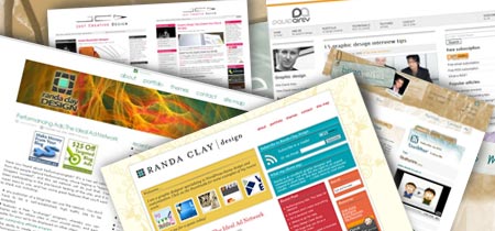

This is my first summer as a "blogger" and so I am not sure how often this happens in the design blogging community, but if you haven’t noticed, a few of our favorite designers have revamped their popular sites recently.
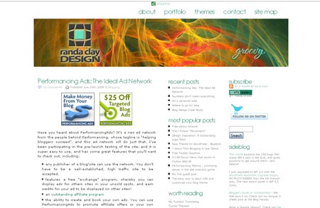
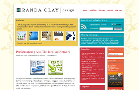
RandaClay.com has been completely re-designed, with a nice splash of color and comforting organization. The background image in the header gives her site a nice design that follows through to the line breaks in between each post and section. A cool feature on Randa’s new site is the small "testimonial" snippet that seems to change regularly. Also, she has decided to display samples of her work more prominently on the homepage, with an aim to get right to the point with any potential clients viewing the site.
Here are some words from Randa about her new design
One of my goals for this design were to bring my design work more “front and center”, and have done that with the “Welcome” section at the top of the main page, as well as the client testimonials at the top of the sidebar. I also wanted more color than the prior design, because lots of color just makes me happy!
Have a look at her before and after:
Before
After
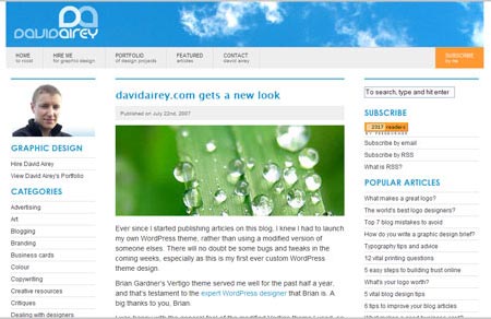
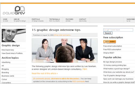
DavidAirey.com has also undergone pixel surgery, and David’s new look presents a much more mature, professional look. The cloud images in the header have been removed in favor of a simple slim orange line, and his logo. The header are has been slimmed down so that the content gets pushed up higher on the page and more quickly accessible for those with smaller screen resolutions and monitors.
David has also changed his main photograph of himself which really ties in nicely with the new look of the site. The previous image showed him in a much more casual light, whereas the new picture gives him a professional, more serious look. Slightly surprised that he didn’t sport the new glasses however!
With over 72 comments (at the time of writing) on his post asking for feedback on his site design tweaks, you are sure to read a variety of differing opinions and thoughts on his changes!
Here is a look at David’s before and after
Before
After
JustCreativeDesign.com is another well known blog that has had a few changes made to it’s overall look and color scheme. Here is a snippet of what Jacob says about the changes:
I changed the colours of the sidebar headers to JCD’s trademark pink colour as people suggested making the “site a bit less grey”, “more colourful”, “not so white”. What do you think?
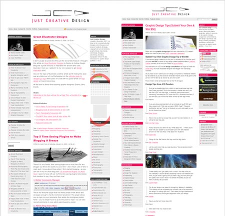
The one major aspect of Jacob’s new layout is the fact that the header has been shrunk down substantially. The previous header and logo was far too big and took up a lot of space. A similar change to David Airey’s site.
And finally, this post seems like the perfect time to initially present my own re-design that I started on about 5 days ago. It is in the very early stages and I am changing my mind each day that I look at it, but I hope to have it launched soon.
Before
After
(there has even been some changes to the new design during the course of writing this post!)
The current design and layout was barely customized by me when I originally launched it as I had no idea what I was doing with the WordPress Platform. I have since learned a lot about this powerful tool, and realized how easy it is to actually customize a WordPress Template into your own creation. If you are a Dreamweaver user, you can even use ThemeDreamer to work on the templates if you like "Design View"!
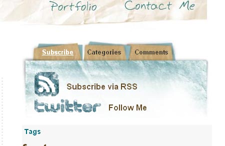
The new design I am working on gives the site a completely new look. I wanted to use this design as a fun, creative outlet to play with some brushes and effects that I haven’t really spent too much time on. One of the main features I wanted for my new blog layout was a tab system for the categories and other lists like that. This new tabbing addition has really organized the overall layout pretty nicely, rather than having extremely long, and boring lists stretching down the page.
New Tabs
I also wanted to give myself a new logo. Something very simple. I have not had a chance to really spend a lot of time on this aspect of the blog re-design, but right now, it looks like this:
New Logo
I like it because it is simple, yet professional and clean. I am not trying to brand myself too much as I send any business that comes from my blogging adventures to the company that I run. So I am happy to have a simple logo that is just to the point and uses the new color scheme. My favorite part about a logo design like this is that the font really takes the lead in presenting the overall identity. The font is given it’s chance to shine!
Please visit my test url to view the new design and template in action and come back here if you have some feedback! I would really appreciate any thoughts you have. Tony at OnWired gave his opinion and it helped out quite a bit!
Other blogs that have recently gone through a few changes:
Creative Curio
Spoon Graphics Blog
EatingDesign.com