
Just like the fashion industry, web designers and the designs we create are often influenced by trends. Whether it’s a background texture, a type of font or a shape, web designs struggle to remain timeless in an ever changing visual, digital world.
Over the years, the general look of the internet has changed drastically, and very much for the better. Excellent websites today are about content, ease of use, responsive web design and fast load times. Of course, there are still millions of websites online that haven’t been updated for many years, and as a result, have become victims of the trend-induced industry of web design.
The Animated Gif
(when they were cool in the 90’s, not the ones used in internet memes we enjoy today)
In the 90’s and early 2000’s, many websites suffered from the animated gif disease that we now make jokes about, like the ridiculous “hammering a nail” to represent a website that was under construction. To say that these animated gifs were distracting would be an understatement. Cartoon animated gifs were dedicated to grabbing your eyes away from the important information on the page, and they did their job so well.
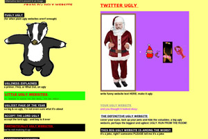

This outdated web design trend still occurs today unfortunately. A few years after the web design industry was first introduced to the world, boxes were a huge hit on most website pages. Every bit of content was in a box; paragraphs had their own box, the main navigation had its own box, even a small mailbox gif got its own box. A lot of this was as a result of the table-based HTML that web designers used originally to create websites and this trend is still quite prevalent in many websites seen around the web today.
It is common practice for modern web designers to use a grid system to lay out a website design because after all, good design is organized design. The human eye is trained to follow order and a grid-based foundation for any design is always a good way to start. However, using grids doesn’t mean that everything has to have an actual border around it. Modern web design in 2013 is all about clean, open space and flowing, full browser width content.
Stock Images


That’s right! All those perfectly staged pictures that you’ve got on your website of handsome men in fancy suits shaking hands in front of a skyscraper are causing your website to look out-dated. Stock imagery is slowly becoming a much lesser part of web design as we move away from using imagery that tries to represent services or businesses, and we actually use REAL photography of the actual business or service (sounds crazy I know!) .
Using photos of your actual staff, office or service in action will grab the attention of your website visitors much more than an unoriginal picture of five models sitting in a fake boardroom with blank pieces of paper and a computer that isn’t turned on. With modern advances in cameras (and so many of us having a smartphone in our pocket) , there’s little excuse for using stock photos for your business anymore.
Widgets Everywhere
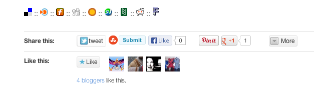
This is a more modern web design trend that needs to end. With the huge growth of web publishing platforms like WordPress, many non-designers have been able to get their hands on their own websites, and while this can be a great thing, it can also be bad.
Too often you visit a blog today and there are widgets everywhere; Twitter and Facebook buttons at the beginning and end of the page, a sidebar full of Facebook feeds, Twitter feeds, weather widgets, scrolling RSS feeds, and the like. Widgets like this are the modern version of the leopard running in place gif, and using too many can have a negative impact on the user experience of your website. Most widgets load data from external sources and this slows down the performance of each page of your website, frustrating your users further. Finding the right balance between your content and widgets is an important task in good, modern and clean web design.

There was a time when designers thought that the bevel layer style in Photoshop was the greatest thing in the world, and we all used admittedly more than we probably should have! The same story goes for shadows and gradients. Today, the best web designers have evolved to using CSS3 as a result of the innovation that has been happening in our industry, and as the most used internet browsers upgrade their rendering engines. When using effects like bevels, shadows, and gradients in modern web design, less is more. Using effects like this in a subtle way can really enhance the visuals, but overdoing them will date your website quickly.