I recently designed a poster and postcard for a Mercedes Benz dealership and their partnership with a local performing arts hall. Here was the brief:
Design a poster that communicates the message that we are giving away tickets to the Broadway series. To be in with a chance to win, they must come to the showroom, and we want the ad to encourage them to also test drive the new 2010 GLK while they are there.
So, I got to work. Firstly, I got the document ready in Photoshop, 22 x 28 inches, 300 dpi. I gave it a .127 bleed to work with.
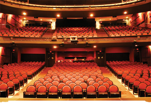

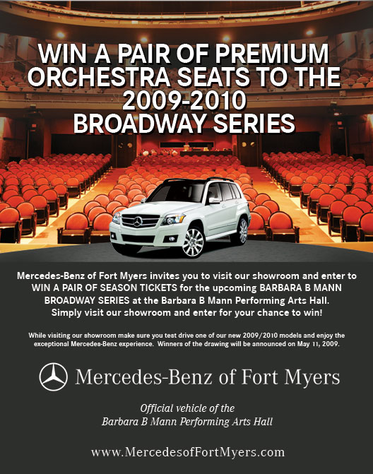
I decided that a decent stock image of the interior of a theater would work nicely, as the posters were to be placed inside the lobby area of the performing arts hall. This imagery would also give me the upscale look I was hoping to create to tie in with the Mercedes Benz brand. So, I placed the above stock image into the photoshop document, and sized it to take up just over half of the poster vertically.
Then, I added dark grey to the bottom half of the poster, pulling the color from a Mercedes Benz brochure. I then decided it was time to place in the main message of the poster, and the text I was supplied with was, “WIN A PAIR OF PREMIUM ORCHESTRA SEATS TO THE 2009-2010 BROADWAY SERIES”. I added this text and after some formatting, it started to fit nicely. The upper level of the seating in the image needed to be darkened down so that the white text would stand out clearly. The font type used is the the standard Mercedes Benz font, Corporate S.
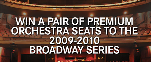

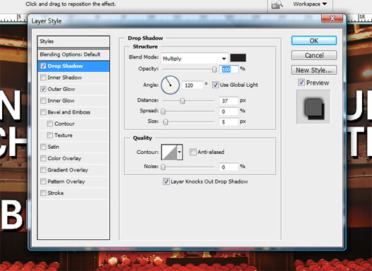
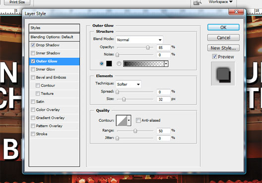
By adding a slight drop shadow ( opacity=100%, angle=120, distance=37px, size=5 ) and dark outer glow ( opacity=85%, size=32 ), the text now popped and would be easily legible from a distance when viewed in the lobby of the performing arts hall.


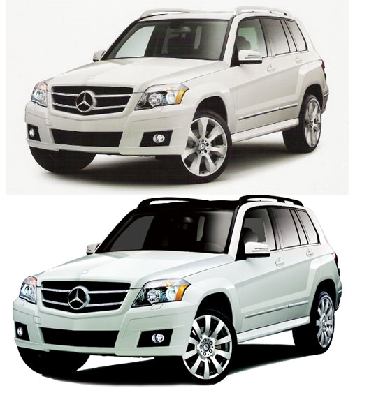
The 2010 GLK car image was going to be placed on the stage, so I had to first create a stage and then clip the image of the GLK that I was provided with. I created the stage in three steps. First, I drew an elongated oval shape in light grey, with the pen tool spanning the width of the poster. I then duplicated that layer, and added a filter to it. ( Filter > Render > Fibers ) To give it somewhat of a spotlight look, I masked over right and left hand sides slightly.


Once the stage was complete, I placed the clipped GLK layer, and placed it onto the stage. I carried out some photoshop work on the car to enhance it a little, and you can see the changes I made in the before and after image below.

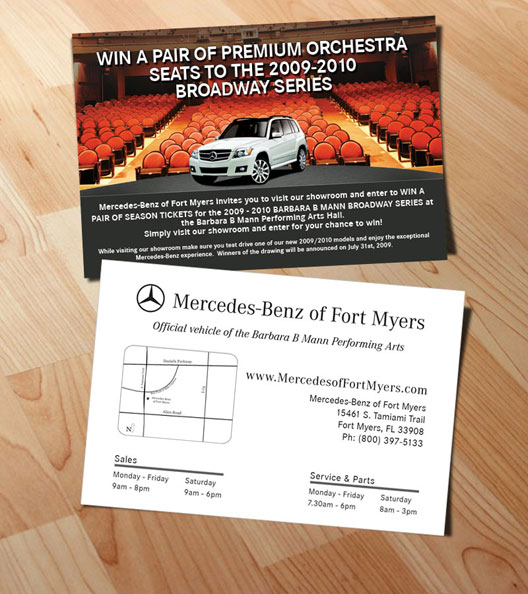
To finish it off, I placed in the additional text supplied by the client and the poster was ready for print. I flattened all layers and pdf’d it and sent it off. The postcards were designed in the same style to match the posters, and together they make a nice impact inside the performing arts hall on show nights.