There are many things to consider when designing a logo , from developing a concept, to the final production. Along the way, sometimes a logo will start to move in a bad direction. This is often down to either an inexperienced designer, or a client that just wants what they like, and doesn’t realize that what they want and what they need may be two completely different things.
Number 1: Simplicity

Don’t overload the imagery of a logo with unnecessary elements. Often, a client may struggle at first with realizing the power of a minimalistic logo design , but it is your job to communicate with them and discuss the reasons why simplicity is so important and effective.
When developing a concept, take a step back and think to yourself "Are there elements in this design that don’t serve a strong purpose?". If there is, get rid of them and work back to presenting the concept in a more simple, yet striking way.
Number 2: Filters and Effects
Just because the software you use gives you all of these lovely effects, doesn’t mean you are a great designer when you use them! When creating a logo, and moving from your sketches to digital, try keep your use of these tools to a minimum.
If your logo design is good enough, it should "pop" without the need for drop shadows, bevels and so on.
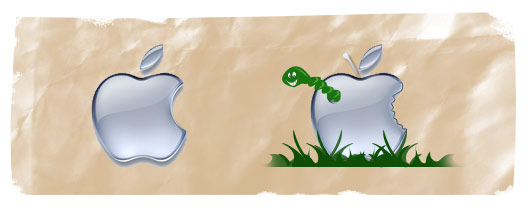
Number 3: Inappropriate Imagery
Believe it or not, but I have had to add a cross to a completed logo design for a company that had nothing to do with religion. They were a marine product manufacturer. Imagery like this in a logo is completely inappropriate. Why alienate potential consumers by using a cross in your logo? What is the cross trying to achieve?
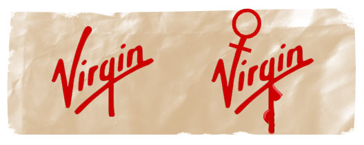
Anything that could be offensive should never appear in a corporate logo. This goes far beyond obvious imagery like the "Virgin" example above, as there can often be sublte elements that can alienate potential members of society. For example, a real estate company using a large blue sky image in the header of their site, with large bright sun rays coming through the clouds could appear to be presenting "God-like" imagery. Coupled with some quotes from the Bible on the website and now you see where this is going….
If a client asks for such imagery in their logo design, simply discuss the potential negative side of this, and if they demand that you still do it, it’s up to you whether you agree to or not.
As a designer, have you ever been asked to add certain questionable elements to a logo design for a client?
Have you created wonderful simple logo designs and had to leave it behind because the client was unable to see the power of simplicity? I would love to hear your thoughts and past experiences.