This was an exciting design project for us to receive, as this client is soon to be the most popular restaurant in our area. It is currently under construction, and will be part of a $20 million Luxury Yacht Club & Marina property.
The Brief
The imagery in the logo was an important aspect to ensure that it gave off the “waterfront” feeling. The restaurant will be mainly visited by the large number of tourists that visit this area each year, and so the identity of the restaurant has to feel “vacation” like, and give off the sense of “holiday destination”.
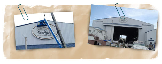
In addition, the property is going to have a large sign outside facing the water, so that boaters passing by the marina will be able to see the logo, along with the Yacht Club logo which is already up.

The restaurant also spends a large amount on print advertising, so the restaurant logo design had to be striking and keep in line with the overall Yacht Club brand that has already been firmly established in the area.
Ideas and Concepts
The Yacht Club is a luxurious membership only property, with the restaurant open to everyone. The logo design for Bayfront Bistro had to give off the “luxury” feel, but also had to be somewhat casual to ensure that visitors understood the type of restaurant it is. It’s not too fancy, but it’s not “walk in from the beach with your bathing suits on” either.
So, the design had to portray both upscale, yet casual.
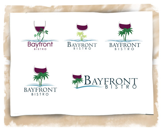
Immediately, I had my first concept. Wine glass and palm trees. The wine glass shows the class, and the palm trees give it a relaxing touch. The two seemed to fit the balance I was looking for in this imagery and so I began to sketch a few concepts around this idea.
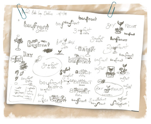
15 hours of traveling to Europe is a great time to get some logo design sketches done! So, as I developed the wine glass and palm tree concept, it soon began to take shape. If you notice from the sketches, I did have one idea that I thought was pretty interesting; Using the wine glass shape as the “y” in Bayfront.
Some other concepts that I worked on are shown below. The client sent each concept to a large group of people, as a small piece of market research, and most seemed to favor Logo #1 quite a bit. Second in line was the concept discussed above.
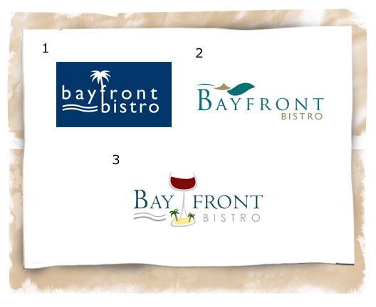
Logo 2 was my personal favorite mainly due to the fact that it is much more subtle in its imagery and it is a more creative, and abstract way of presenting the message. The idea in Logo 2, is that there are 3 elements displayed…united into one mark. Wind, Sail, Water. These three elements combined give off a slight “sea shell” image, adding to the “waterfront”, “beach” idea.
Logo 3 was another way of using the wine glass and palm trees, but the client decided that the word “Bayfront” could not be split up in that way.
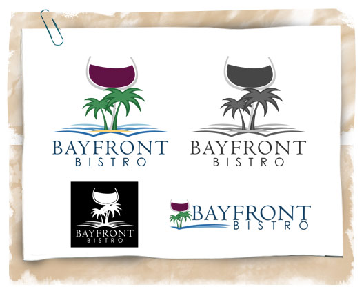
So, I developed the original concept further, and we decided that it would be wise to have a horizontal version as well as the vertical version for the format of the logo .
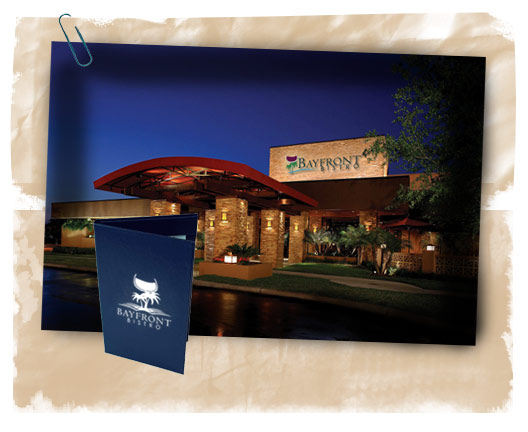
Once we had the final logo nailed down, I mocked up how the logo would look applied in different ways.
Here it is added to a restaurant building as signage, along with a sample menu.
Here is the final logo, along with the horizontal format