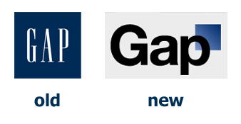
The revenue issues Gap have been experiencing recently doesn’t have much to do with the branding. The problems all stem from the generic identity of the clothing, the lack of style and mundane fashion involved in their products. With this new brand identity, it appears that the corporate suits at Gap headquarters felt that the traditional Gap brand was partly to blame.
The gradient of the logo really cheapens the overall identity and it lacks any sort of strength or visual interest. It’s a struggle to really understand how this new logo came about, what its purpose is and why it fails on so many levels. I’m sure we’ll find out as the days go by……