We start with Part 1 of this 7 part series on Logo Design Composition.
Each week I will write a small post for each part to help those of you unfamiliar with logo design composition and the overall importance of this logo design aspect in the creation and development process of an identity.
Logo Design Composition is the organization of the elements contained within the design, and how they are used in their surroundings. Each part of this series will deal with the following: Format, Symmetry, Proportions, Combination, Distortion, Colors, and Spacial Design.
 | Part 1 : Format |
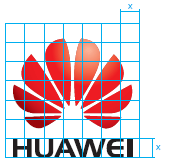
The fomat of the logo can provoke certain impressions and associations. As with most design work, there is a basic grid outlined for a logo, and from the original grid there are 3 standard formats that a logo can be formatted in.
1. Portrait
2. Landscape
3. Quadratic
The aspects that can determine which format you choose for your logo design depends on the intended use of the logo (print, online, interactive etc), and the area around the logo (the elements that interact with the design).
The format of a logo determines how the logo will be used in the various media. Often, the identity takes on two different forms depending on the medium it is published on. The logo is created in both a portrait format and a landscape format.


Next week, Part 2: Symmetry
